

#6 How to actually read retention: curves, lifecycle charts, and cohorts

This post walks through the three views I rely on for retention analysis — the retention curve, the lifecycle bar chart, and cohort analysis. To put them to the test, I built a single synthetic chess.com dataset with five shocks deliberately buried in it, then checked which view catches each one.
1. The retention curve
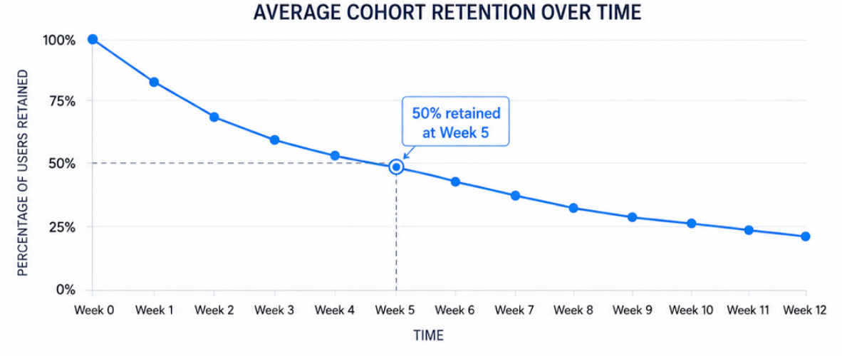
The retention curve plots the average percentage of each cohort still active over time, and it's the most honest test of whether you have product-market fit. Interpreting it is straightforward: if the curve starts at 100% and falls to 50% by Week 5, half your users are gone within a month.
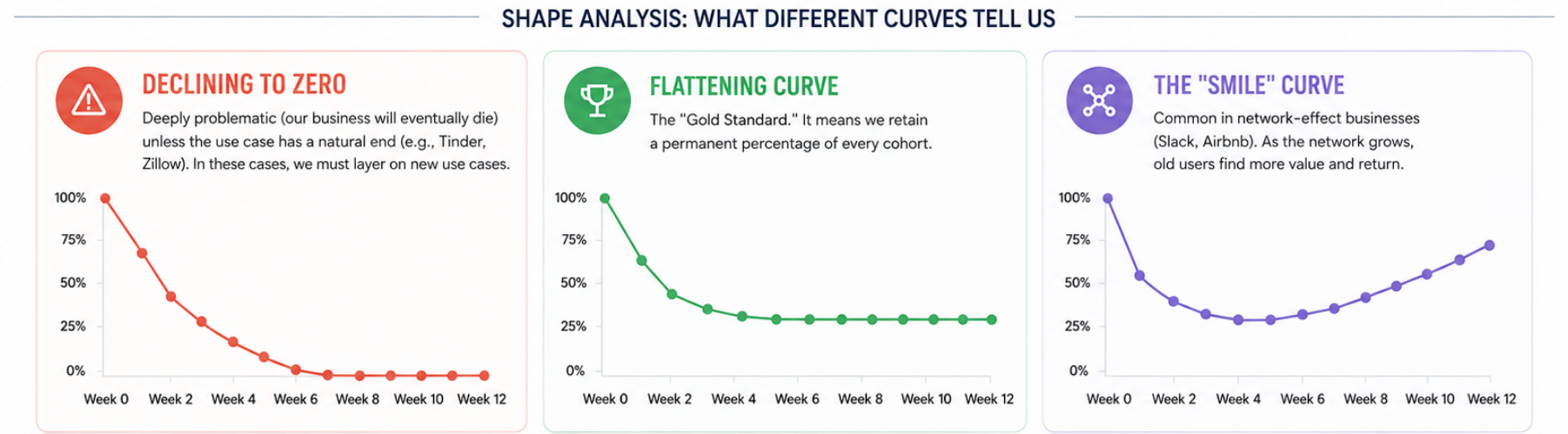
What really matters is the shape. A curve that declines all the way to zero is deeply problematic — it means the business will eventually die, since no slice of any cohort sticks around. The main exception is a product with a natural endpoint, such as Tinder or Zillow, where users are expected to leave after achieving their goal. A curve that flattens out, by contrast, is the gold standard: it means you retain a permanent slice of every cohort indefinitely. And in network-effect businesses you'll sometimes see the best shape of all — the "smile," where the curve dips and then curves back up, because as the network grows, old users discover new value and return.
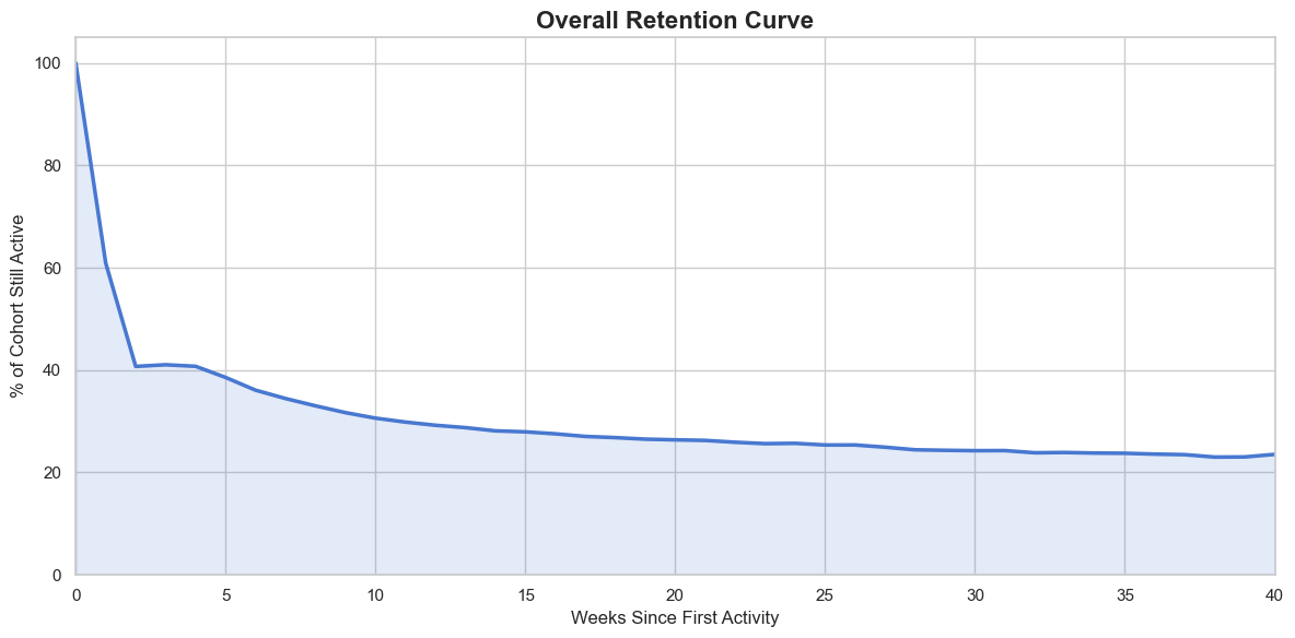
For the synthetic chess.com dataset the overall retention curve shows the classic shape you'd expect: a steep drop in the first few weeks, followed by a long, slow flattening. Nearly 60% of the cohort churns within the first two weeks, falling from 100% to around 40%. The decline then decelerates sharply — retention drifts from roughly 40% at week 2 down to the mid-20s by week 15, and settles into a stable plateau just above 20% for the remainder of the 40-week window. That flattening tail is the signal that a durable core of users has formed, even as the curve tells you little about why the early drop-off happens.
2. The lifecycle bar chart & quick ratio
The simplest way to look at your business is the plain active-user count — one line, trending up and to the right. It looks reassuring, and it tells you almost nothing about how you're growing. A line like this can climb steadily while serious problems fester underneath, because a single number can't show you that you're losing users as fast as you're adding them. Two businesses can post identical WAU growth and be in completely different health.
That's exactly what the Lifecycle Bar Chart is built to expose. Instead of collapsing everything into one line, it breaks your user base into four mutually exclusive states each period (in this example, measured week over week). New users are appearing for the first time — your acquisition engine. Retained users were active last period and are still active now; they're your loyal core and usually your most valuable segment. Resurrected users were inactive for a stretch and have come back, which is your read on how well win-back efforts are working. And churned users were active last period but didn't show up this one — typically drawn as a negative bar below the axis to represent the outflow.
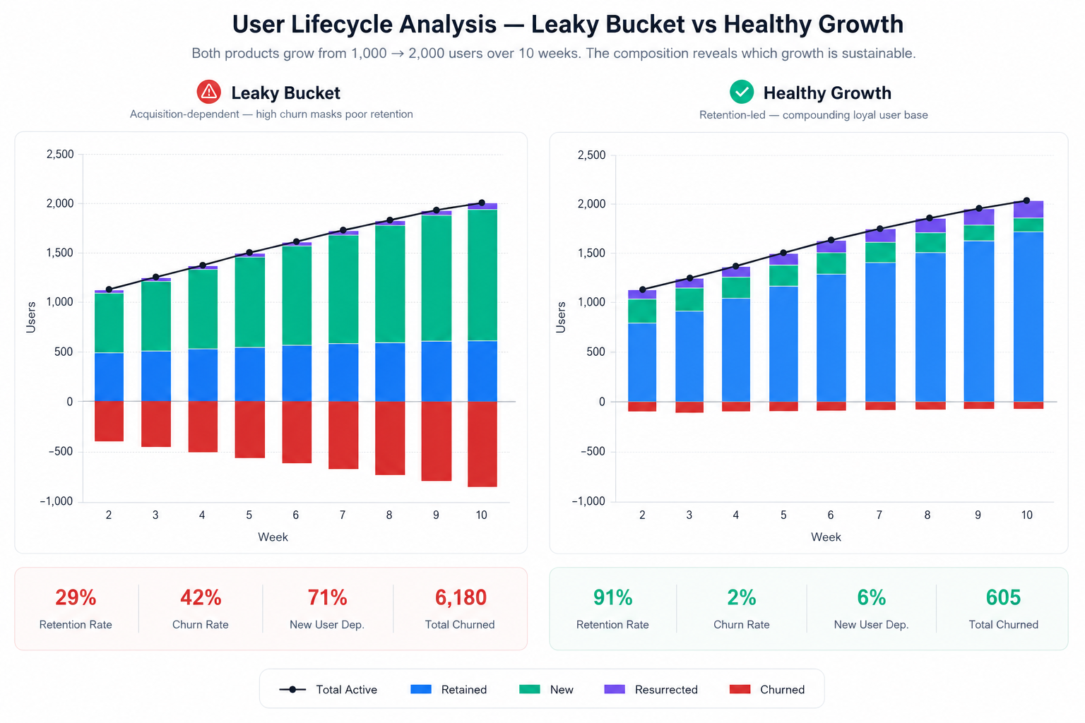
Decomposing growth this way shows you whether the growth is actually real. Is it driven by genuine retention, which is healthy, or by constantly buying new users to replace the ones churning out, which is expensive and unsustainable? The chart also surfaces patterns you'd otherwise miss — a spike in resurrected users after a feature launch, or a jump in churn after a UI change. It turns a vanity metric into a diagnostic tool that tells you where to invest next: acquisition, retention, or re-engagement. PostHog, Mixpanel, and Amplitude all offer a version of this, sometimes under names like "growth accounting" or "lifecycle analysis."
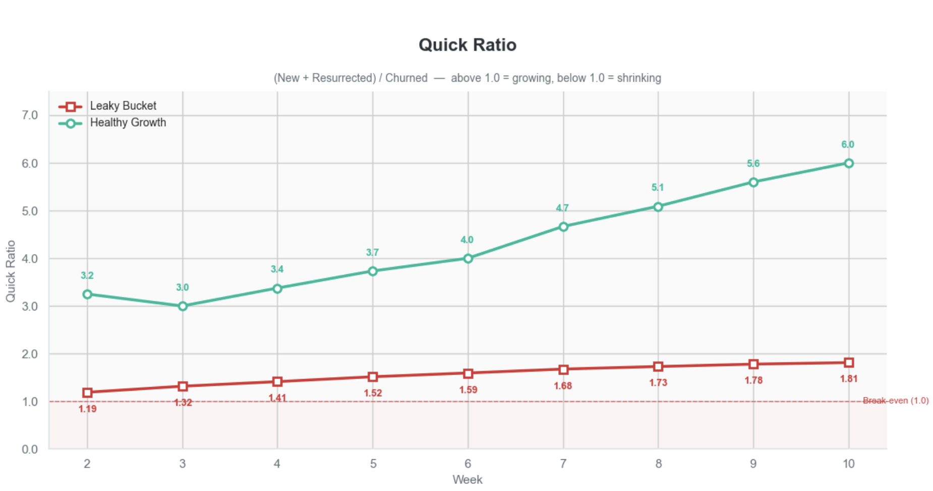
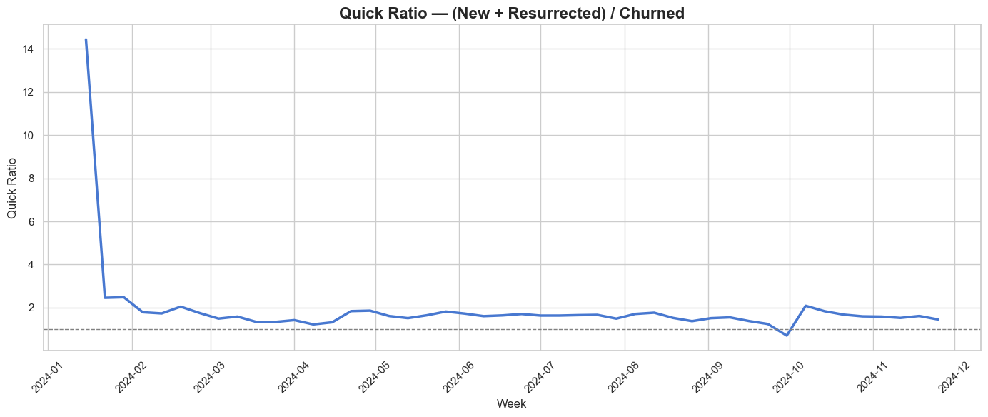
The quick ratio
The quick ratio — (New + Resurrected) / Churned — tells you how many users you gain for every one you lose. A ratio of 1.0 means you're treading water, anything below that means you're shrinking. A quick ratio above 4.0 is often cited as a benchmark for healthy growth.
What makes it powerful is that it exposes the quality behind a growth curve. Two companies can both double their WAU, but the leaky bucket sits at 1.2 while the healthy one hits 6.0 — identical top-line growth, completely different sustainability. Pull the acquisition budget from the leaky bucket and its ratio drops below 1.0 immediately. The number even points you toward the fix: high churn dragging it down means you have a retention problem, while a weak numerator means you have a distribution problem. One number, two possible diagnoses.
Applying it to the chess.com data
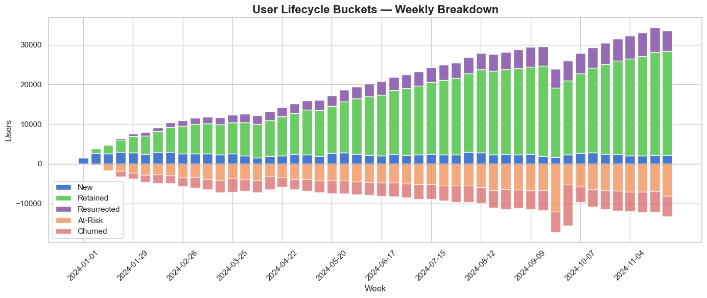
Applied to the chess.com data, both views tell a consistent story. The lifecycle bar chart shows a user base that's genuinely growing: the green retained band expands steadily from January through November and dominates the stack, meaning growth is driven by a loyal core rather than churn-and-replace. New and resurrected users add a smaller, steady layer on top, while at-risk and churned users below the axis grow in proportion — never outpacing the gains. The at-risk band is the one borrowed from the Duolingo growth model, and it's what changes the game: by flagging users who are slipping before they actually churn, it turns the chart from a post-mortem into an early-warning system you can still act on (later I will write a separate article about it). The quick ratio confirms it. After an early spike above 14 (an artifact of the first weeks, when there's almost nothing to churn), it settles into a stable band between roughly 1.3 and 2.0, holding comfortably above the 1.0 break-even line for the entire year. The one exception is a brief dip below 1.0 in late September — a single week where churn outran new and resurrected users — before the ratio recovers. Healthy, sustainable growth, with one visible shock worth investigating.
This is the first view where one of the five shocks actually surfaces — but the dip only tells us that something broke in late September, not what. For that, we need to dig deeper.
3. Cohort analysis
Setting up the data
To show how cohort analysis works in practice, I'll use the same synthetic chess.com dataset. About 10,000 new users sign up each month — roughly 2,500 a week — with some natural variance. We track two core metrics: NURR, the new user retention rate, which is the share of users who come back after their first week, and CURR, the current user retention rate, which is the share of already-active users who stay active the following week. As you'll see, these aren't the same as the cohort retention rates themselves; they're derived from the lifecycle bar chart and the Duolingo growth model, which I'll cover in a separate article.
The five-shock bullet list (fix: your first bullet is indented one level less than the rest — flatten them so all five sit at the same level):
- In March, a bad marketing campaign attracts the wrong users; NURR drops to 12%, and those users churn quickly.
- In April, the marketing budget gets cut, so fewer users sign up but the ones who do behave normally.
- From May through July, a new onboarding flow rolls out and NURR jumps to 60% — a massive improvement in early retention.
- In mid-September, an external outage takes down the AI feature, causing a 30% drop in weekly active users.
- And underneath all of it, gradual product improvements push CURR from 78% to 86% across the whole year.
Why Cohorts, Not Just Lifecycle Bar Chart
Cohorts are groups of users who started at the same time. A lifecycle bar chart tells you what happened this week — you gained 2,500 users, lost 1,800, reactivated 300. It's a snapshot. On the chess.com's User Lifecycle Buckets - Weekly Breakdown chart you can see the churn spiked in September, but you can't tell who is churning or why.
Cohort analysis adds the dimension of when users started. Instead of one bar for "churned users," you get a row for every signup week, tracked forward in time, and that gives you three things a lifecycle chart simply can't.
- First, it shows you where in the journey users drop off — if the March cohort loses 88% in Week 1 but the June cohort only loses 40%, you know something changed in the early experience, an activation problem the lifecycle chart would only report as "churn went down."
- Second, it tells you whether the product is getting better or worse over time, since comparing cohort curves reveals whether newer cohorts retain better than older ones; a lifecycle chart might show stable weekly actives while masking the fact that you're acquiring more users and retaining them worse, the two effects canceling out.
- Third, it isolates external events from product changes — when the September outage hit, every cohort dropped simultaneously, a diagonal stripe across the table, whereas in a lifecycle chart that just looks like one bad week.
In short, the lifecycle chart tells you the what; cohort analysis tells you the who, when, and where — which is what you actually need to decide what to fix. All the cohort views come in weekly and monthly granularity, and I'll switch between them as we walk through the five and see which shocks each one catches.
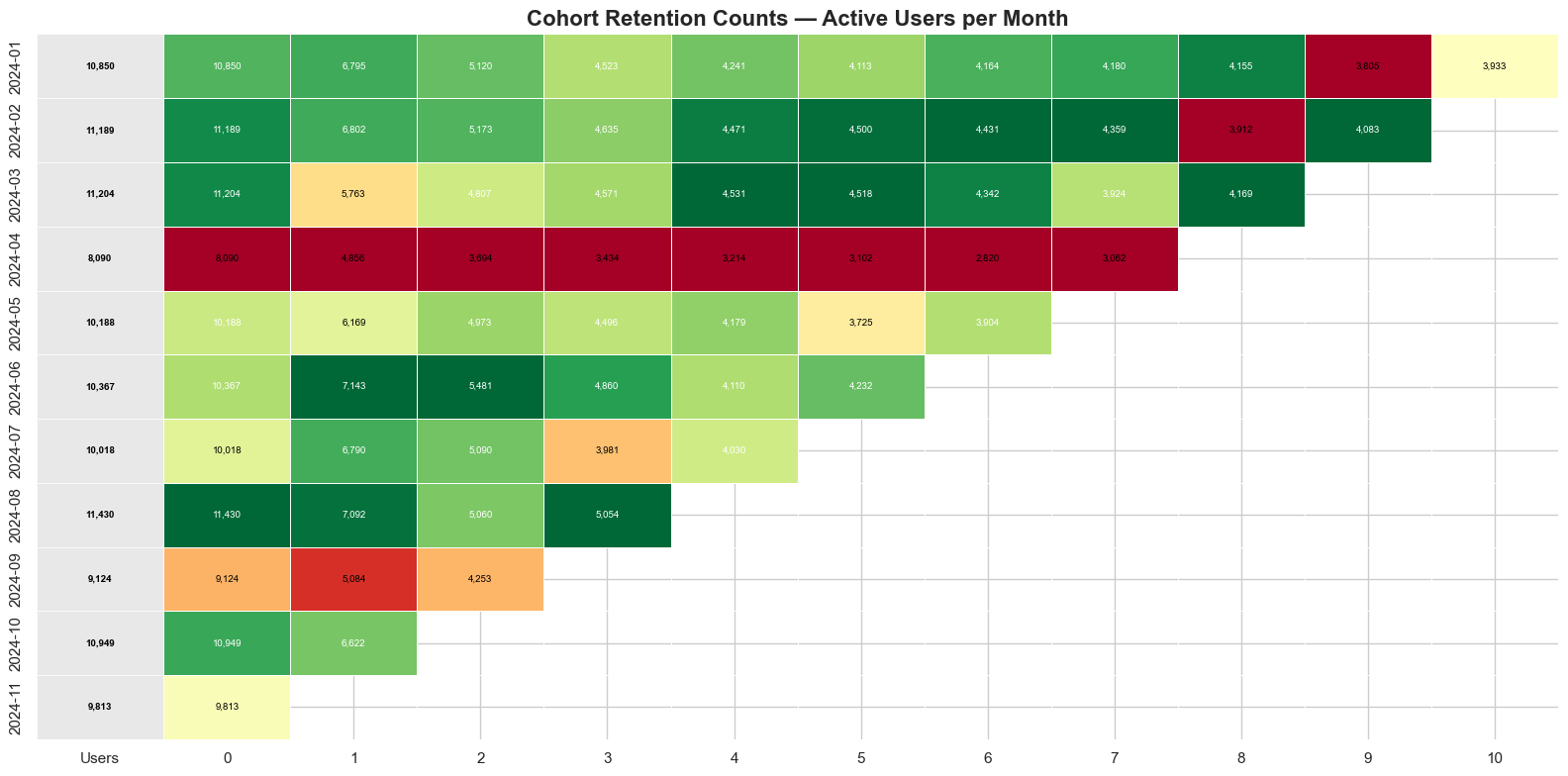
Retention counts
We start with the raw numbers — how many users from each cohort are still active week by week. This is where volume tells the story. Look at April: the rows are physically shorter, not because people retained worse, but because fewer people signed up in the first place. That's the marketing budget cut, shock number two, caught. If you only looked at percentages you'd miss this entirely — the rates look fine, but the business is bringing in fewer people to retain.
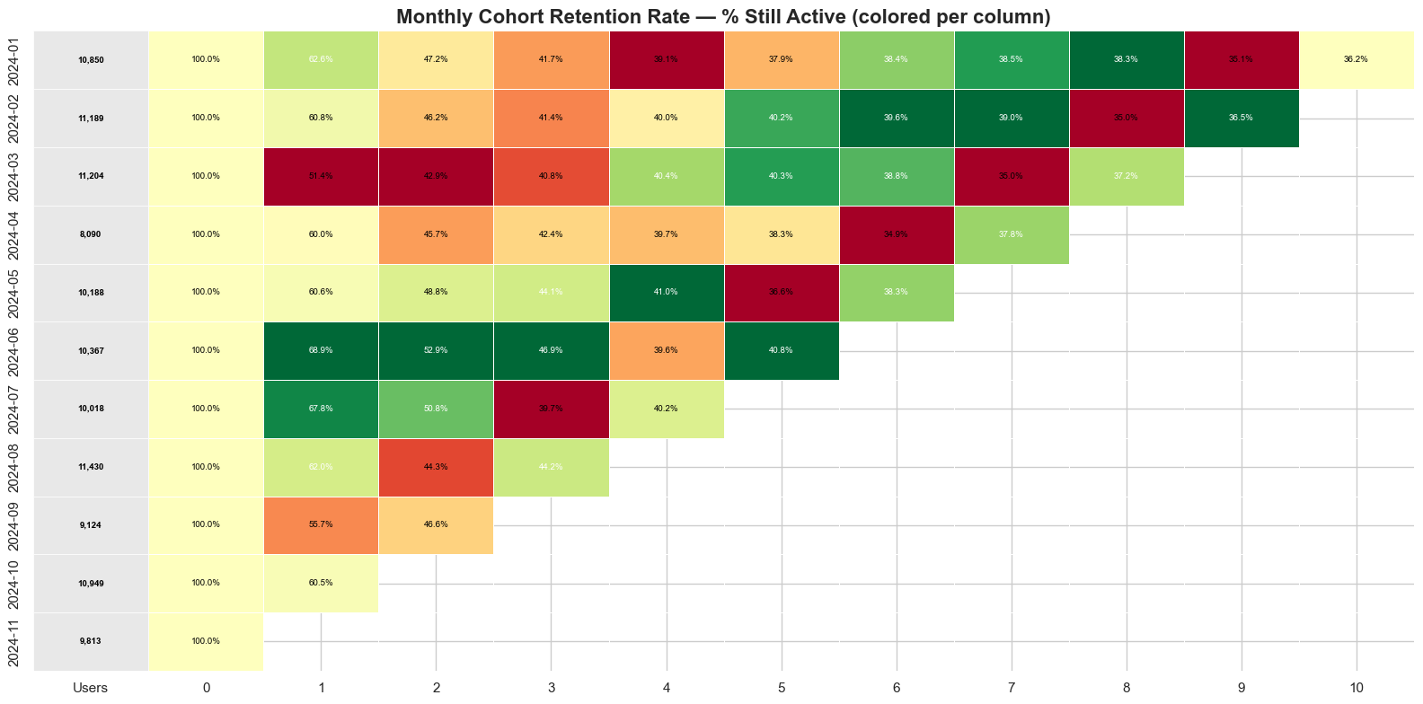
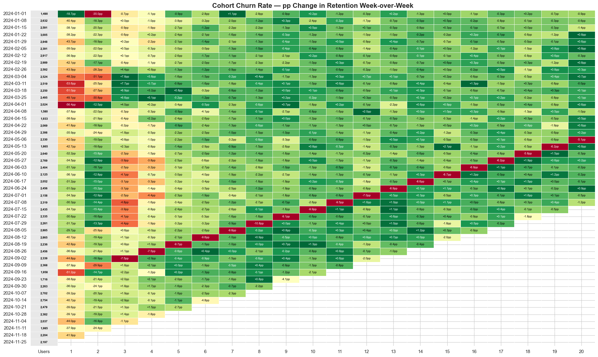
Retention percentage
Now we standardize. Every cohort starts at 100% and we watch it decay, which strips away the volume differences and makes a cohort of 1,500 and a cohort of 3,000 directly comparable. That's where March jumps out, shock number one: the signup numbers looked normal, but the first-week drop is brutal, because NURR fell to 12% on the back of a bad campaign that attracted the wrong users. You can also see a diagonal stripe cutting across September — every cohort, regardless of age, dips at the same time. That's the AI outage, shock number four. When a single column hurts all rows equally, you're looking at an external event, not a product problem.
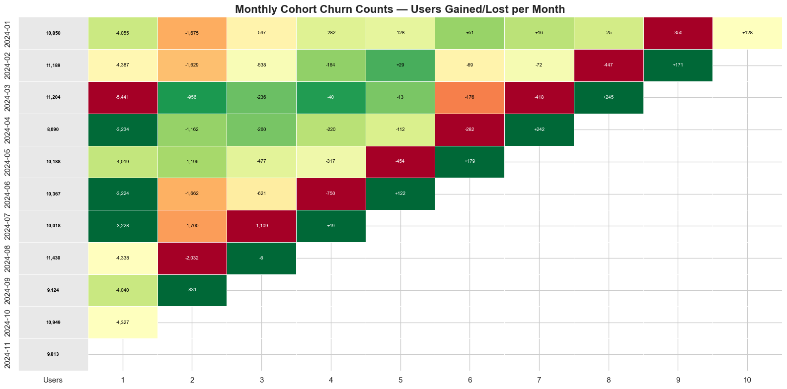
Churn counts
This flips the lens: instead of who stayed, we ask how many people we lost each week. It matters for prioritization. A 5% churn rate sounds small, but if the cohort started with 3,000 users, that's 150 people walking away. Bigger cohorts generate bigger absolute losses even at the same rate, so this view tells you where to focus resources for the most impact.
Churn percentage
Now we normalize the churn and ask what share of the original group dropped off in each period. This is where you compare apples to apples and can track whether your Week 2 drop-off is getting better or worse over time. Notice how the May through July cohorts have a noticeably lower churn rate in the early weeks — that's the new onboarding flow, shock number three, showing up clearly.
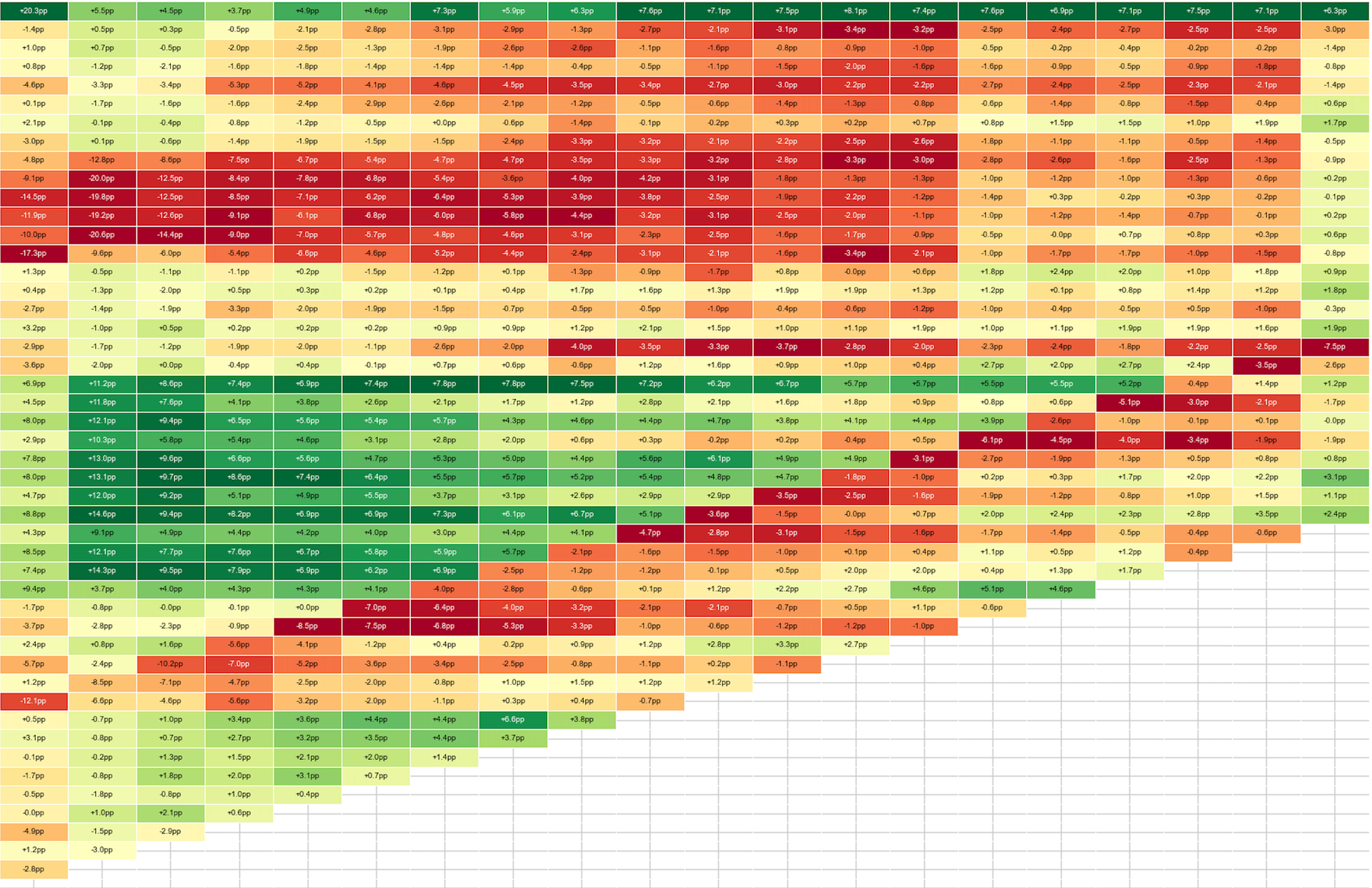
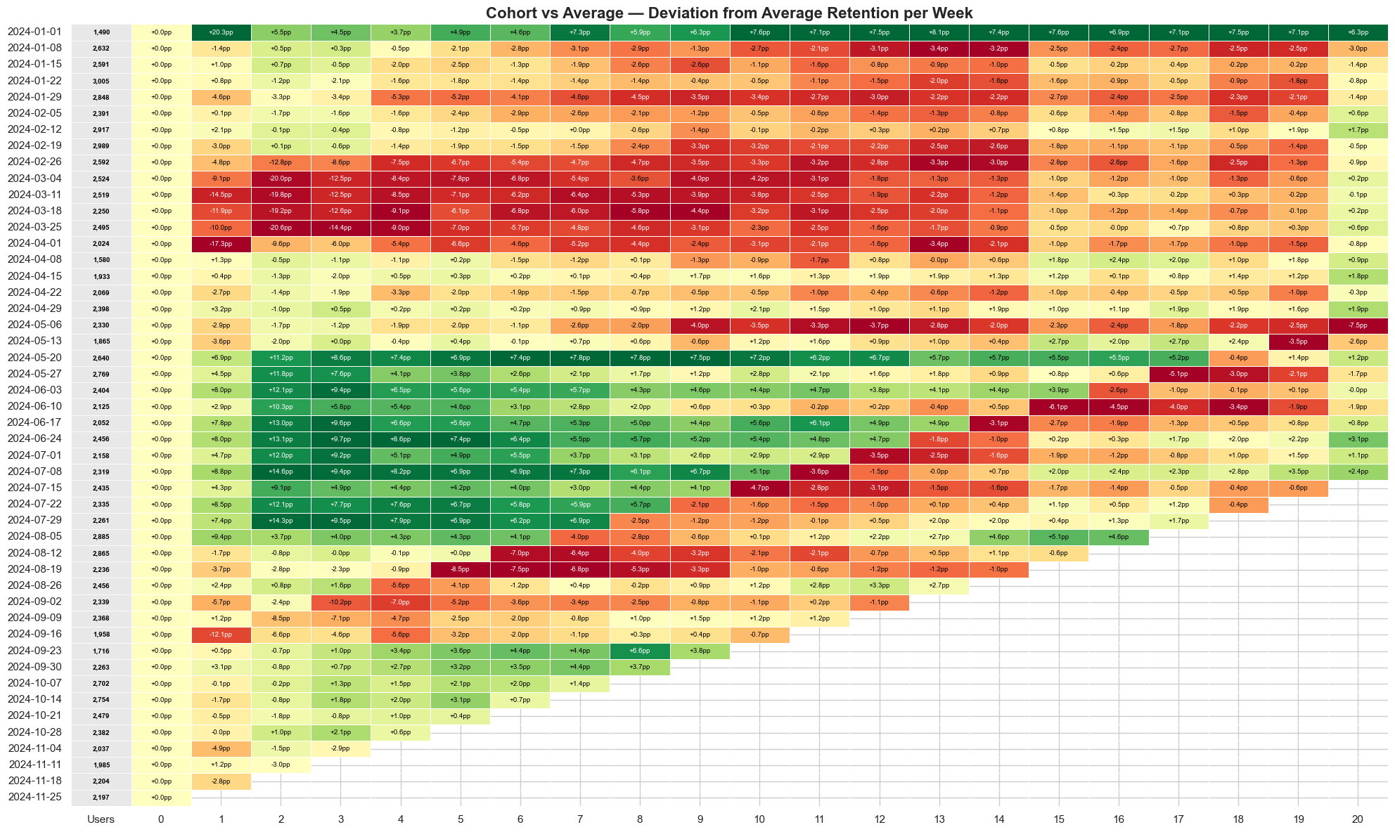
Average relative
This is the detective view. It takes every cohort and compares it against the overall average, so anything near zero is normal, a strong positive means that cohort is outperforming and you should figure out why, and a deep negative means something went wrong. The March cohort sits well below average; the May through July cohorts sit well above. And if you look at the overall trend, later cohorts consistently edge higher — that's the gradual CURR improvement from 78% to 86%, shock number five, the quiet one that's easy to miss without this view. The beauty of Average Relative is that it makes outliers impossible to ignore: if you see a cohort 20% above average, go find out what happened that week, because that's your playbook for doing it again.
Putting it together
No single view tells the whole story. The retention curve tells you whether you have product-market fit at all — does any slice of a cohort stick around, or does the line slide to zero? The lifecycle bar chart tells you whether this week's growth is real or just churn papered over with acquisition, and the quick ratio compresses that into one honest number. And when something looks off, cohort analysis is what lets you point at the cause — the who, when, and where behind the what. The companies that compound aren't necessarily the ones acquiring fastest; they're the ones who watch all of these together and act on the retained segment before it leaks. The ones that collapse almost always had a number flashing red before the end. The whole point of these views is to make sure you're the one who sees it first.
The dataset and the code are available on GitHub here: https://github.com/gaborberei/datadiner.
No spam, no sharing to third party. Only you and me.